All the Data’s a Stage – guest blog by Murray Dick
All the Data’s a Stage: An exploration of theatre, exhibition and literary device in effective data visualization
This project started off in an obscure spat in the field of statistical communication at the end of the nineteenth century, featuring a publisher of popular reference works (Michael George Mulhall), and his nemesis, French statistician Alfred De Foville.
De Foville took exception to Mulhall’s popularising approach (which featured slick publishing techniques, including the use of scaled pictograms), dismissing his work as mere mise en scène.
Turning this criticism on its head, this project asks what if there is more to be explored in the effective use of mise en scène in data visualization, in terms of better informing the public?
Twenty A2 posters were designed, and a range of representational (and cognitive) metaphors were captured, as backgrounds, for the display of civic information about North Jesmond. These posters are on display in the Catherine Cookson room, in Jesmond Library, until the end of August, 2023.
This project draws on many common elements in story-telling, but it also makes use of three novel visual structuring devises: metaphor, vocabulary, and grammar.
Visual metaphor
Metaphors are defined in this project according to contemporary cognitive metaphor as structuring devices that sit within our language, mapping meanings from one (well-understood) domain to another, that help us to make sense of the world. They take the form of image schemas, and may be found in spoken, written or visual forms; and may be expressed in representational ways, or as sayings or idioms. Consider the following poster:
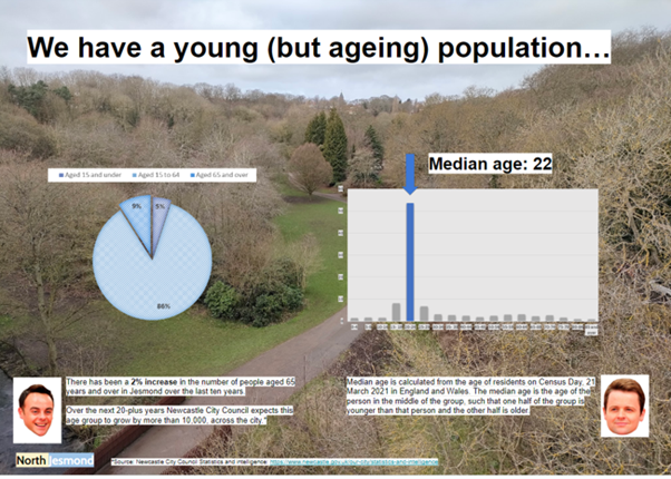
Here Jesmond’s age demographics are displayed within the lived environment its residents call home. This view, featuring a path that runs through Jesmond Dene, viewed from the Armstrong Bridge, represents a SOURCE-PATH-GOAL image schema – centring the ‘path of life,’ which all residents share.
Visual vocabulary
Elsewhere in the field of cognitive psychology, it is argued that the shapes we use to communicate abstract ideas are influenced by the shapes we have developed to help us manage and structure the real world.
The visual vocabulary in this project is influenced by the types of statistics explored, concerned with living in North Jesmond (hence containment). Colour is also used to attach certain meanings to the visual vocabulary; charts about residents employ shades of blue – rather than disparate colours, reinforcing the idea of a shared community.
Visual grammar
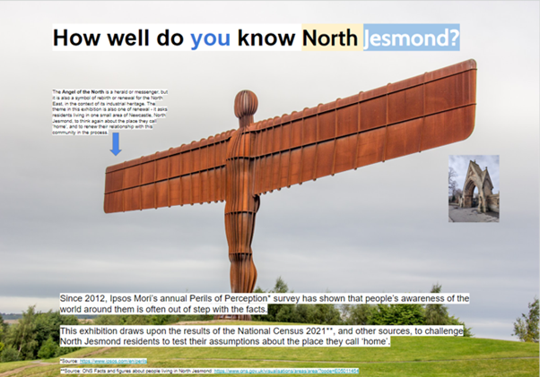
Critical linguists argue that it is possible to map some of the elements of spoken grammar (pragmatics, semantics, syntax) to visual communication. Consider the following poster:
Here the title ‘How well do you know North Jesmond?’ is expressed visually left-to-right – featuring a subject (YOU – highlighted in blue); a verb (KNOW – the wingspan vector of the Angel of the North) and an object (NORTH JESMOND – represented by the image of the arch in Jesmond All Saints cemetery).
It is hoped that an effective use of storytelling, including visual metaphor, vocabulary and grammar in these wall-mounted designs, will make them more engaging, and more memorable, in terms of how people perceive civic information.
Murray Dick is a Senior Lecturer in Multimedia Journalism at Newcastle University.
The exhibition North Jesmond in Statistics is currently on display in the Catherine Cookson Room of Jesmond Library during normal Library opening hours.
